What Happens to Financial Markets During the COVID-19 Pandemic? A Quant’s Analysis
ALEXANDER KAHL
23 March 2020 • 12 min read

Table of contents
COVID-19 is affecting nearly every aspect of our lives. Fear and uncertainty are shaking global financial markets and crypto currencies. Self quarantine is slowing down our lives and social interactions. On the positive side, however, we have more time to consume all sorts of information. Therefore we want to use this opportunity to provide you with a quick time series analysis of most recent events.
In the following blogpost, we show how we can use Python to get an overview of the current market environment from a quantitative perspective. We explore the COVID dataset from Kaggle, Crypto Currency market and traditional asset class data. This is by no means meant to be a scientific treatise, but rather an illustration of concepts and ideas.
More precisely, we use the Corona Virus dataset available on Kaggle to visualise the outbreak of the virus in various countries. As a next step we take a look at crypto currency data from Binance to examine some stylised facts common in times of extreme volatility and crisis. Then we compare these effects to data from traditional asset classes (YahooFinance). Last we conduct a correlation analysis in the crypto currency market, which indicates, that "contagion" is mainly driven by a flight to safety into stable coins.
Visualising the COVID dataset
We use the daily dataset from Kaggle to visualise the number of confirmed Corona cases and their growth rates. We focus on data points of the following countries/regions in alphabetical order:
- Austria
- France
- Germany
- Italy
- Mainland China
- South Korea
- Spain
- UK
- US
This selection of countries/regions is (very subjectively) based on severity of the outbreak and or importance for the world economy.
After looking at the number and growth rates of confirmed cases, we also calculate the number of officially infected people (confirmed - recovered cases) per observation date, to see at what levels strong market corrections happened (Black Monday and Black Thursday).
Before we start, we load packages common for data and time series analysis. We currently support numpy and pandas in our own Trality Editor. We use matplotib and seaborn for more advanced charting capabilities.
Now we are ready to explore the COVID dataset.

As stated on Kaggle the relevant columns have the following interpretation:
- Sno - Serial number
- ObservationDate - Date of the observation in MM/DD/YYYY
- Province/State - Province or state of the observation (Could be empty when missing)
- Country/Region - Country of observation
- Last Update - Time in UTC at which the row is updated for the given province or country. (Not standardised and so please clean before using it)
- Confirmed - Cumulative number of confirmed cases till that date
- Deaths - Cumulative number of of deaths till that date
- Recovered - Cumulative number of recovered cases till that date
As mentioned in the description from Kaggle, the actual number of cases (confirmed, recovered and deaths) might be lagging behind the relevant observation date. For the purpose of demonstration we stick to the ObservationDate anyway.
In order to visualise the outbreak of the virus we first transform the data to obtain the time series for confirmed and recovered cases as well as deaths. To do this we write a simple helper function that returns all time series in a dictionary for selected countries.
To adhere to the DRY principal we use another utility function for plotting,
We start by looking at the number of confirmed Corona cases per observation date for our selected countries.
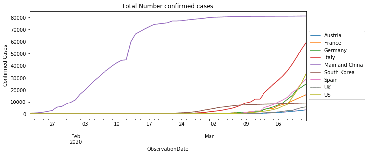
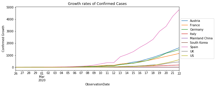
Clearly China has the most number of confirmed cases. However, in terms of growth rates Europe is much worse off.
Finally we calculate the number of "officially" infected people (confirmed - recovered) per observation date. Even if though the number of actual infections is much higher than officially reported, it is still interesting to see at what high levels markets only started selling off. Since China already has decreasing number of infections we exclude them here.
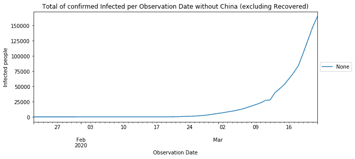
On Black Monday the total number of officially infected people for our selected countries reached more than 20.000 people. On Black Thursday, this count increased to more than 27.000. As of 22 March it exceeds more than 164.000 people.
These drastic effects of contagion have also been throughly studied form a mathematical modelling perspective. One of the simplest approaches to modelling infectious disease is the SIR Model.
Exploring the Crypto Currency dataset
This dataset, taken from Binance, contains daily prices, and ranges from the beginning of 2019 until present (20.03.2020). We consider 14 major symbols for quote currencies USDT, BTC and EUR. Since the majority of transactions on Black Monday and Thursday affected USDT pairs, including stable coins into the analysis seems natural.
The data for every symbol is stacked onto each other and comprised in alldata. We show the first 5 rows to see its structure.

Here we see open, high, low, close, volume and trades data for different symbols on daily intervals. closetime indicates the closing time of a daily interval (UTC+2).
Now that we have seen our stacked dataset, we want to isolate prices, volumes and trades for all currency pairs. To simplify things we store the results in a tsdata dictionary follows:
In a next step we look at the price evolution of currency pairs in March 2020.
Heavy Corona impact on Crypto prices
In order to make the Corona Virus impact on prices among currencies comparable, we normalise the time series for currency pairs from the beginning of March and average over symbols.
We can now plot this time series and annotate Black Monday and Thursday.
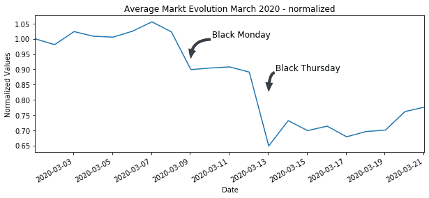
As we can see, the first hit on the crypto market started around March 9th (Black Monday). The real contagion in crypto markets started on March 13th Black Thursday with some currency pairs dropping more than fifty percent. The average market has lost more than 30% of its value from the beginning of March.
Spike in volumes during Sell-off
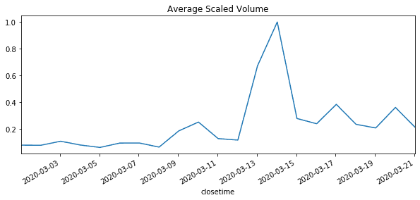
Fear and uncertainty also has a high impact on trading volumes and is commonly inversely related to price changes. To standardise volume data we use the min-max scaler. This way, we can avoid the problem of different units of measurement and level dependency. Again we take the average over volumes. As we can see a spike in trading volumes coincides with drop in average prices.
Wild market swings in times of distress
One characteristic of financial returns is that in periods of market distress extreme market movements tend to be followed by extreme market movements. This phenomenon is known as volatility clustering. Its consequences are far reaching as some commonly used assumptions in Finance break down - most notably the assumption of normality. For detailed exposition the reader is referred to this paper on Asset Returns.
Usually we can inspect volatility clustering by plotting absolute returns. High absolute returns concentrate in periods of market stress. The appear in clusters.
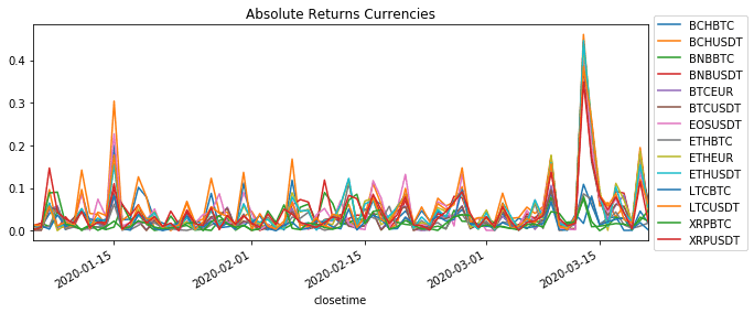
Even though the history is not yet long enough, we see first indications of clustering and it seems very likely that this situation is going to persist for some time.
Exploring Traditional Asset classes
In this section we look at price time series from traditional asset classes. Our dataset consists various time series from commodities, indices and currencies.
- Commodities: Gold, Oil,
- Indices: S&P Index (US), 30y Treasury Bond Yields (US), Hang Seng Index (China), SX5E (Europe), FTSE (UK)
- Currencies: EURUSD Currency, GBPUSD Currency
Our dataset comprises daily price data from YahooFinance.

The YahooFinance also includes open, high, low, close and volume data. The field ticker indicates the respective commodity, index or currency. As these time series do not represent directly traded instruments we ignore volume data.
Strong hits in commodity and equity markets
As before with the crypto currency data we look at the average price impact on the markets of traditional asset classes.
We again normalise the time series for traditional assets and highlight the development in March 2020.
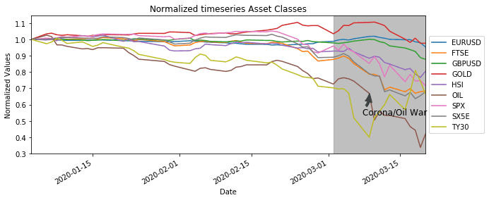
Contrary to our crypto currency dataset, which represents only one market, we look at very diverse markets here. Nevertheless, as of March most asset classes where moving in the same direction, with the exception of bond yields of course - they have an inverse relationship to prices.
Wild price swings affect all asset classes
Plotting the absolute returns for traditional asset classes also shows the clustering effect of volatility.
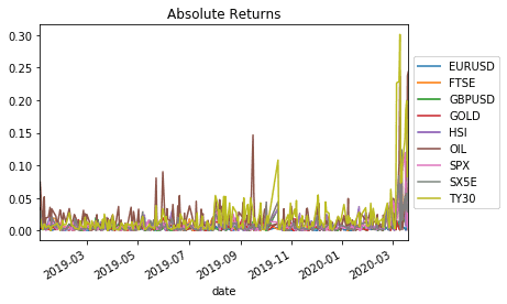
The fear of a spreading virus and its consequences seem to have infected both traditional and crypto currency markets in similar fashion. At least at first sight we find similar reactions on prices and volatility.
Correlation and spillovers in Crypto Currencies
There is a lot coverage on high correlation in Crypto Currencies. The Binance Report 2019 states that median correlations in the Crypto Market continue to remain high. Also popular media seems concerned. CoinTelegraph, for example, talks about the influence of BTC on ETH and vice versa. Apart from the misconception between causation and correlation, it presents two opposing views on the relationship between BTC and ETH. Estimation of dependency in time series poses a lot of challenges (see UCL research note).
The effect of the corona crisis on crypto has resulted a flight to safety. As a result we expect to see different average correlations among stable coins pairs and BTC pairs. To get an indication we split out data into two sets. One set contains all pairs with stable base currencies (USDT, EUR) and the other set contains BTC pairs.
In order to mitigate the problem of estimating time series dependency, one can monitor rolling correlation and detrend returns in every window of the rolling period (see Contagion in Crypto). For our purpose we will simply normalise rather than detrend all return time series in the respective windows. For this we create a little helper function.
Next we calculate rolling correlations for both sets and plot the results.
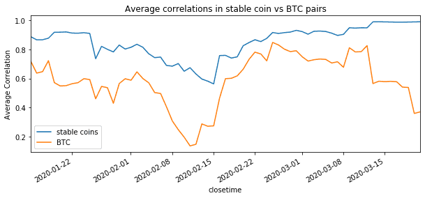
In conclusion of the above, it seems that the extremely high correlation in the market are mainly driven by a flight to safety into stable coins. Liquidity concern and other fears might have worsened these conditions. All other currency pairs show less correlations and might return to normal levels sooner.
Empirically rolling correlations tend to be a good indicator of market sentiment well in advance. Due to their mean reverting nature they have a wide range of applications in trading.
Quantitative analysis to avoid bias
Crisis situations often result in in typical market patterns that can be observed in traditional asset classes as well as Crypto Currencies. Most of the information required to analyse and understand these patterns is public and easily retrievable, making quantitative analysis a powerful tool to make sense of it. Key take-aways for the analysis above are:
- Prices and volumes tend to be negatively correlated. High trading volumes are commonly associated with price declines. Everyone wants to get out at the same time.
- Panic causes even more panic. High prices changes tend to be followed by high price changes. In terms of volatility we can observe a clustering effect.
- A flight to safety has driven average correlations in stable coin pairs to extremely high levels. Correlations in BTC pairs are much lower and seem to stabilise quicker.
- Python is cool and we should use it more often
We hope you have enjoyed this. Please let us know if you have any thoughts comments or suggestions. Just drop us an email under [email protected].


